Design challenge for a sports booking platform, 2024. Less than a week
Scope
Timetable widget for browsing and booking classes (desktop)
What I delivered
UX audit, field interviews, redesign proposals, interactive prototype, roadmap
The problem
Customers couldn't find their class
Venues kept adding activities to the same timetable template. The calendar got longer and denser, and customers complained that they couldn't find specific activities.
What I did
Audited, asked, then redesigned
I evaluated the live timetable on three venues' websites, visited two studios to hear from instructors, and redesigned the calendar, cards, filters and activity pop-up.
The outcome
A prototype, tested live, and an order to build it
New layouts for every step of the flow, an interactive prototype I used to run a live usability test in front of the interviewers, and a Now / Next / Later roadmap.
01The brief
The platform gives sports venues a timetable template with activity cards, so their customers can book classes. As calendars grew, the template stopped scaling.
The company had noticed complaints from customers about finding specific activities, as calendars kept growing. Every class a customer can't find is a booking the venue doesn't get, so this matters to customers, to venues and to the platform.
The challenge: develop possible solutions to simplify browsing and booking activities.
The same template on three venues' websites. Each venue customises colours and content, which changes how readable the timetable is.
02My approach
I started from what customers actually go through, and looked for real feedback before proposing anything.
Audit the live flow
I went through the booking flow as a customer on three venues' websites, and listed the problems at each step against design principles (Nielsen's heuristics, Laws of UX).
Talk to people
I wrote an interview script for venues and visited two studios that use the timetable, to hear how it works for them and their customers.
Secondary research
Public customer reviews of the service, best practices for timetables and filtering, and competitor analysis.
Propose, then prototype
Wireframes with notes explaining each change, then final layouts and an interactive prototype for a usability test.
What I heard at the studios
“The cards look all the same, and too close from each other. They should be a bit differentiated, somehow.”
Yoga instructor
“At the beginning it was weird to find the right information on the cards to understand which class to go to, and it was hard to find the day.”
Sound healing instructor, books through the platform
The yoga instructor also told me that people often miss the location of the practice, even though the timetable has a "branches" feature for it.
The limit of this research: two conversations, and neither person manages the timetable herself. I didn't have time to find more regular customers, so I used the interviews to check my audit, not to replace it.
The flow I audited
Four steps every customer takes, with the main issues at each one.
Step 1
Search for the right class
The widget scrolls inside a page that already scrolls. The top bar takes a lot of space. Filters have no titles, so you can't tell what you selected. Nothing shows which day is today.
Step 2
Click the class card
Cards have different sizes, similar colours, too much text and poor contrast, with no breathing room. Statuses like "sold out" or "cancelled" are shown inconsistently.
Step 3
Read the activity details
The pop-up is vertical on a wide screen, the image is very large, and key facts like free spots and level sit at the very end.
Step 4
Book
The button says "Register now" while the company always calls it "booking". States like "unavailable" look different each time.
Audit of step 1: finding a class.Audit of steps 2 to 4: card, details and booking.
03Key decisions
Five decisions shaped the redesign. For each one: what I saw, what I changed, and why.
Decision 1
Give the calendar a time axis
What I saw
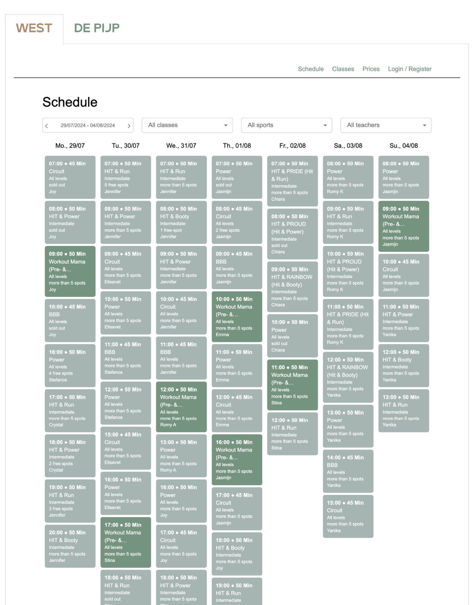
Days were just stacked columns of cards. On some sites they were grouped by "morning, afternoon, evening". All the timing lived inside each card, and nothing showed which day is today.
What I changed
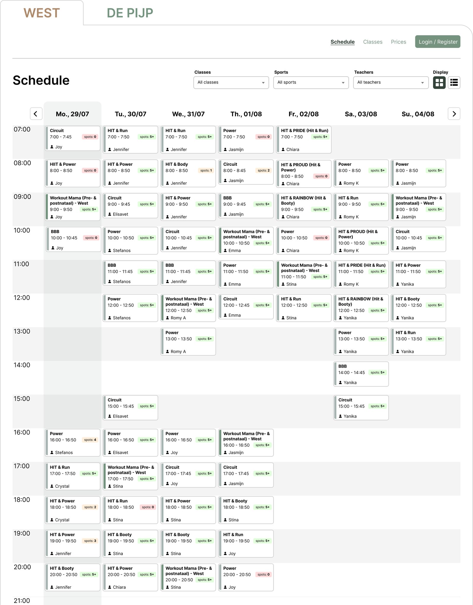
Hours run down the left side, with visual dividers.
Card height follows the duration, and gaps between activities are real gaps.
Today is always highlighted.
Week navigation moved to arrows above the days.
Why
People look for a class by when they can go. Putting time into the layout answers that at a glance and lets the cards carry less text. The old week "filter" wasn't a filter at all, so it became navigation.
BeforeAfter
↔
Drag the handle to compare. Same week, same classes.
Backed by research: one instructor said it was "hard to find the day" when she started using the timetable.
Decision 2
Make every card readable at any size
What I saw
Each venue could colour its own cards, which produced intense colours and weak contrast. Time came before the activity name, and nothing told you what each line of text meant.
What I changed
Activity name comes first, then time.
White cards with a coloured line on the left to mark the class type.
Icons and pills label each piece of information.
Availability became a compact pill, from "5+" to "0".
Why
The name is what people scan for. A neutral card keeps contrast safe whatever colours a venue picks, while the coloured line keeps their identity.
Trade-off: short activities show less. A 30-minute class hides the teacher, so the card never overflows.
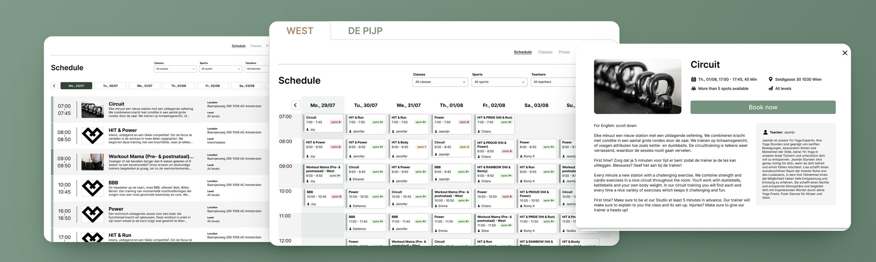
Old cards on the left of "Cards layout", the new system on the right: adaptable sizes, availability pills, online and cancelled classes.
Backed by research: "The cards look all the same, and too close from each other." Both instructors mentioned the cards.
Decision 3
Add a list view for people who want detail
What I saw
The weekly grid is good for an overview, but there was no way to compare classes in detail without opening them one by one.
What I changed
A display switch between cards (weekly) and list (daily).
The list shows start and end time, picture, title, short description, location, level, availability and teacher.
Why
Two different needs deserve two views: "what's on this week?" and "which class today is right for me?".
Trade-off: the list shows one day at a time, so the week overview stays in the card view.
The list view. Location is visible on every row.
Backed by research: people often miss where the class takes place. In the list, the location is on every row.
Decision 4
Filters you can read, and a smaller top bar
What I saw
The top bar used a lot of vertical space and still left empty areas. Filters had no titles, so after choosing one you couldn't tell what was active. What is "sweat"? Is "HIIT" a class or a sport?
What I changed
Each filter has a title above it.
The venue logo has a size limit, which keeps the bar small.
The current section is highlighted.
Logged-out users see a clear "Login / Register" button instead of a text link.
Why
You shouldn't have to remember what you picked: the interface should show it. Less space for the bar means more of the timetable is visible without scrolling.
Wireframes with numbered notes for the top bar, filters and calendar layout.
Decision 5
An activity pop-up built for booking
What I saw
The pop-up was a tall, narrow column on a wide screen, led by a very large image. Free spots and level came last. The button said "Register now", and states like "registration is over" each looked different.
What I changed
Horizontal layout that uses the space available.
Smaller image; date, location, spots and level right under the title.
The button now says "Book now".
One consistent pattern for waiting list and closed registration.
Why
The facts people need to decide now sit next to the button they decide with. "Book now" matches the word the company already uses everywhere else, so customers don't wonder whether registering and booking are different things.
BeforeAfter
The full proposal, with the waiting list and "registration is over" states.
04The prototype
I built a fully interactive prototype inside a venue page, so the redesign could be judged in context and used in a usability test.
The second part of the challenge was to show how I would run that test. I conducted the session live, with one of the interviewers taking the role of the participant, following the script I had prepared: explain that we are testing the prototype and not the person, give the task, and ask them to think out loud.
Result: the feedback was very positive. One session with an interviewer is a demonstration of the method, not a validation, so testing with real customers would be the next step.
The new timetable inside a venue's website.
The test task: find a class and book it
1 · FindScan the week by time.2 · CheckKey facts next to the button.3 · BookDone.
05What to build first
A redesign only helps if it ships, so I proposed an order the team could implement in steps.
Now holds the quick wins, Next the priorities that need more work, and Later what matters less for finding and booking a class.
Now
New card layout
New calendar structure
Next
New list display
New activity details pop-up
Later
Top bar structure
What I'd explore with more time
Branches, classes and sports. The relationship between them is confusing and every venue sets it up differently. It also came up in my studio visit: people miss the location, yet don't use "branches".
Venue customisation. How each venue's colours and icons affect cards, buttons and filters.
AI. How it could help customers find the right activity at the right time.
More interviews. Talk to regular customers and to the people who manage the timetable, which I couldn't reach in the time I had.
06Outcome and reflection
As a design challenge, this wasn't built. I presented the audit, the new layouts, the prototype and the roadmap, ran the usability test live, and the challenge ended with a deep review of the platform's needs.
What I learned
How complicated a B2C platform gets when a lot of important information has to reach the user at once, especially across screen sizes. Every card is a negotiation between what people need to decide and what fits.
What I'd do next
Test with real customers and with the people who manage the timetable, and take the same thinking to smaller screens, where space is even tighter.
Whether you’re ready to start a project or just want to chat about your ideas, feel free to reach out! I’m always open to discussing new opportunities.