Thank you! Your submission has been received!
Oops! Something went wrong while submitting the form.

Lead Designer: design delivery, and the growth of 3 other designers
2022, 4 months
3 designers, 1 Product Owner, 4 developers, 1 Agile Coach. Scrum, fully remote
Passenger app and driver app, both from scratch
MVP ready to launch in the Czech Republic
Prague has great public transport, but people living in its suburbs have few options to reach the city center.
I ran weekly discovery workshops with the business, planned the design backlog with the Product Owner, led research and testing, and guided the team through both apps.
The passenger and driver MVPs were built and tested, with a plan to learn from real rides after launch.
Prague, like many cities, has a great public transportation system. For people who live in its suburbs, though, there are few options to reach the city center.
Citya solves this by picking up passengers heading in the same direction in larger vehicles, with up to 6 passengers. The vehicle picks people up at a stop near them and drops them at a stop near their final destination.
The design challenge: this is a new kind of service. People have to trust a ride that isn't a taxi and isn't a bus, walk to a stop that only exists in the app, and share the trip with strangers. And drivers need to handle it all while driving.
I was the lead designer, responsible for the design delivery of both products and for the professional development of the other designers.
Weekly discovery workshops with the business management team to understand the needs, present designs and build the next steps together.
Together with the Product Owner and the business, we defined the steps to launch the MVPs of both apps.
Design tasks were sized as small (1 point), medium (3) or big (5) by effort, written in Jira and split between us, so we could check our performance every sprint.
Competitor analysis, user interviews, usability tests and user journey maps, so we knew we were building something valuable.
A brand-new service comes with a lot of beliefs. In our workshops we wrote them down as assumptions, turned them into hypotheses and questions, and tracked what we found.
We studied similar services, including Citymove, Savvy Mobi, Via and MOIA, and wrote down what we learned from each.
Semi-structured interviews about daily habits: how people get to work, and what kind of transport they use.
Participants performed tasks on a prototype while thinking out loud. We tested the prototype, not the person.
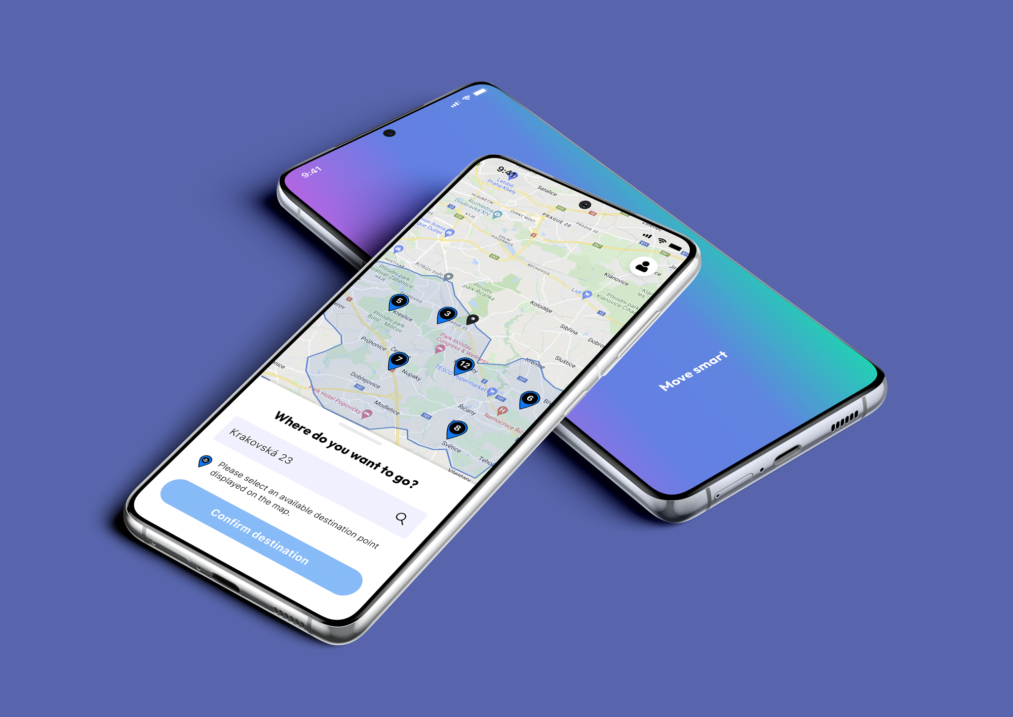
500 m is a lot to walk to a stop. So the pick-up screen shows the walking time and distance before the ride is confirmed.
Waiting felt too long beyond 15 minutes. So the passenger sees a time range, "10 to 15 minutes", instead of an open-ended search.
These are the beliefs from our workshop board that shaped the passenger app most, and where you can see each one in the design.
Show the walk before you commit. The pick-up screen shows the walking time and distance to the stop, and the ride summary repeats it as "1 to 5 min walk", so nobody is surprised.
Make the wait concrete. After confirming, the passenger sees "10 to 15 minutes" with the car arriving at the pick-up point, instead of an open-ended "searching".
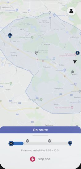
Show the route as it happens. The "On route" screen has a progress bar with every stop and the estimated arrival time, so extra stops feel expected.
Say who is coming. Before pick-up the passenger sees the driver's name, the licence plate and the vehicle model.
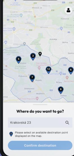
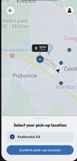
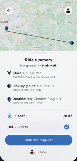
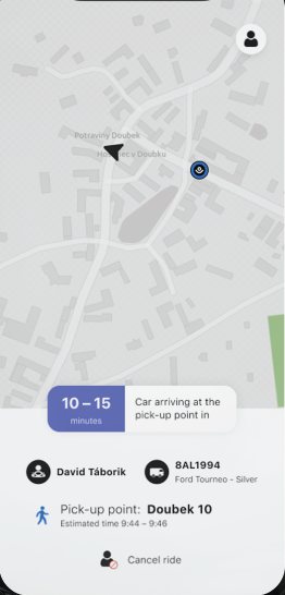
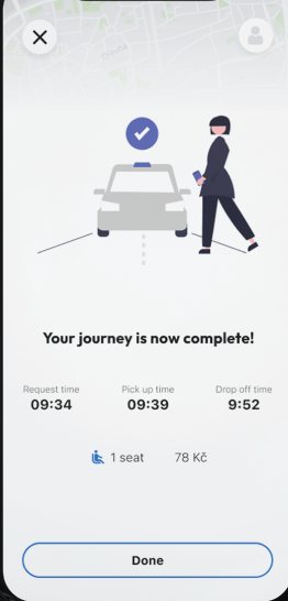
Each screen gives the driver a status, the next stop and a single main button.
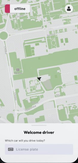
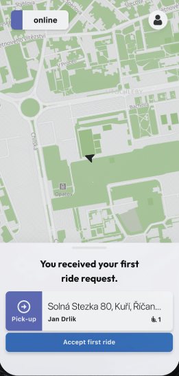
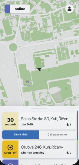
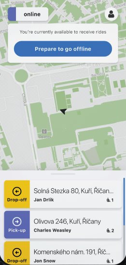
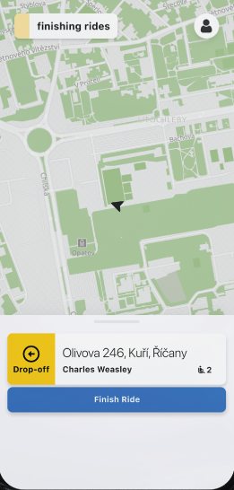
Why: drivers can't read much while driving, so each screen has one action.
The passenger and driver apps were developed and tested. When I left the project, the MVP was ready to launch in the Czech Republic. I don't have post-launch results to share, so this case study focuses on the process.
The team planned to take rides with different passengers and drivers, to take notes, run interviews and observe behaviour.
A dashboard to manage the whole service was being built, so fleet operators could support drivers and passengers.
New features were in development, like pre-booking a ride for passengers.
The three designers grew a lot in their careers over these four months, and we kept sharing knowledge after the project ended. Looking back, I wouldn't do anything differently.