Oops! Something went wrong while submitting the form.
Product Design
Challenge | Ricardo
A one-week design challenge: redesigning how people list an item for sale on Ricardo, Switzerland’s largest online marketplace, so more listings actually get published.
Design challenge for Ricardo.ch, September 2021. One week
Scope
The “sell an item” listing flow on the mobile website
What I delivered
Flow analysis, UX critique, open questions, four incremental proposals, interactive prototype, next steps
The problem
Listing an item took too much effort
Selling started with one very long form: nine sections, two sticky menus and the bottom tab bar, all on one page. Ricardo wanted more listings to reach “published” without lowering their quality.
What I did
Mapped it, critiqued it, then improved it in steps
I mapped every screen and action, listed the questions I’d ask the team, judged the flow against usability principles, and proposed four changes that could ship one at a time.
The outcome
A calmer, three-step flow and a plan to prove it
A focused listing window, safe save and reset actions, a flow split into Product, Transaction and Logistics, consistent components, a clickable prototype, and a plan to validate it with users and A/B tests.
01The brief
Listing items to sell can ask a lot of effort from users. Ricardo wanted a fast, seamless process without compromising the quality of the listings.
I was asked to act as the person responsible for the listing experience on Ricardo’s mobile website, and had one week to prepare a proposal and my recommendations. The brief asked me to pick one of two goals:
Increase the conversion rate: the number of listings successfully published.
Increase the average number of items listed per user.
I chose conversion. If more of the listings people start actually get published, the average number of items per user grows too. Fixing the flow helps both goals, and the published listing is where the marketplace starts to make money.
The brief also said to focus on UX flow, content architecture and UI patterns, and not to spend time on branding or a fully functional prototype.
“How can we increase the conversion rate, the number of items successfully published? As a Ricardo user, I want to list items easily on the platform.”
My problem statement
02Understanding the current flow
Before changing anything, I went through the whole flow on mobile and wrote down every section, every action and every way it could end.
The current form, scrolling by itself. Hover to pause.
One page, nine sections
Everything a seller needs to do sits on a single scrolling page:
Title
Photos: insert, edit, delete, reorder, tips
Product type and its details
Category
Condition & description
Listing type & price: auction or fixed price, increments, dates, relisting
Delivery & payment, including the bank account (IBAN)
Boost your offer: Bronze, Silver or Gold
Review and publish
On top of that, the page kept the bottom tab bar and a sticky menu on the right.
Every action a seller can take, section by section. Section 0 alone holds six actions, and most of them take the seller out of the form or reset it.
The sticky menu
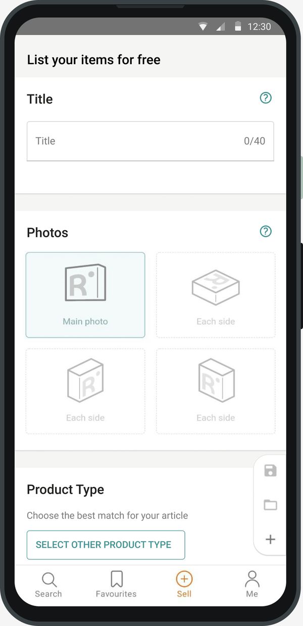
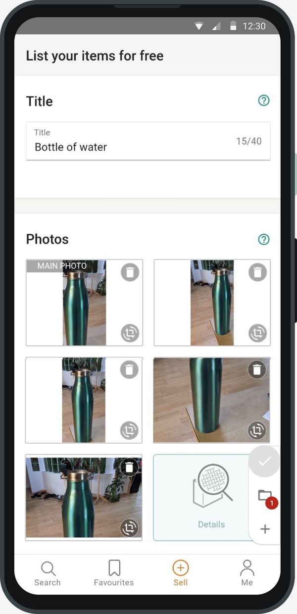
Three floating buttons follow the seller down the page: start a new listing, open draft and save draft. They look the same, but they behave very differently: “new listing” wiped the form immediately, without asking.
What each sticky button does today.
How it ends
When everything is right, the seller gets a success screen. When something is missing, the errors appear as a list at the very end, next to the publish button, far away from the fields they refer to.
SuccessFailure
03Questions I’d ask first
In a challenge you can’t ask the team, so I wrote down what I would want to know before designing for real.
Each answer could change the priorities. I presented them with the proposals, so the team could see which ideas depended on which assumption.
History & goals
How did the flow get here?
What does success look like today, and what is the current conversion rate?
Business
What can’t change?
Which fields and steps are business or legal requirements?
Data
Where do people give up?
Is there data on the sections where sellers abandon the form?
Technology
What are the constraints?
Is there legacy code or platform limits that shape what we can build, and when?
Users
Who is listing?
What do beginners and experienced sellers say? They probably need different things.
Sticky menu
Why is it there?
Why was it added, and how often is each of its buttons used?
04What gets in the way
I grouped the problems into three themes, each tied to a usability principle, so the critique isn’t just my taste.
Critique 1
Cognitive overload
Nine sections, a tab bar, a sticky menu and dozens of decisions on one page. The more options people see at once, the longer they take to decide, and the easier it is to give up.
“New listing” wiped the form without warning. Feedback after saving was easy to miss. Errors appeared only at the end. Each one is a moment where a seller can lose work or trust.
#1 Visibility of system status#5 Error prevention#9 Error recovery
Critique 3
Lack of consistency
Similar inputs looked and behaved differently from section to section: photos, condition, product details, bank account. Sellers had to relearn the form as they went.
#4 Consistency & standards#6 Recognition over recall
My approach: incremental design
Instead of one big redesign, I split the problem into four improvements. Each one can ship on its own, be measured, and teach the team something before the next one. It’s faster to deliver and easier to roll back.
Reduce noise
Give the listing flow its own focused window.
Improve behaviour
Make saving, opening drafts and resetting safe and visible.
Divide the flow
Three short steps instead of one long page.
UI consistency
One set of components for similar inputs.
05Key decisions
Five decisions came out of the four proposals. For each one: what I saw, what I changed, and why.
Decision 1 · Reduce noise
Give listing its own window
What I saw
The form lived inside the normal page layout, with the bottom tab bar and a sticky menu on the right. Six actions could take the seller away from, or reset, a half-filled form.
What I changed
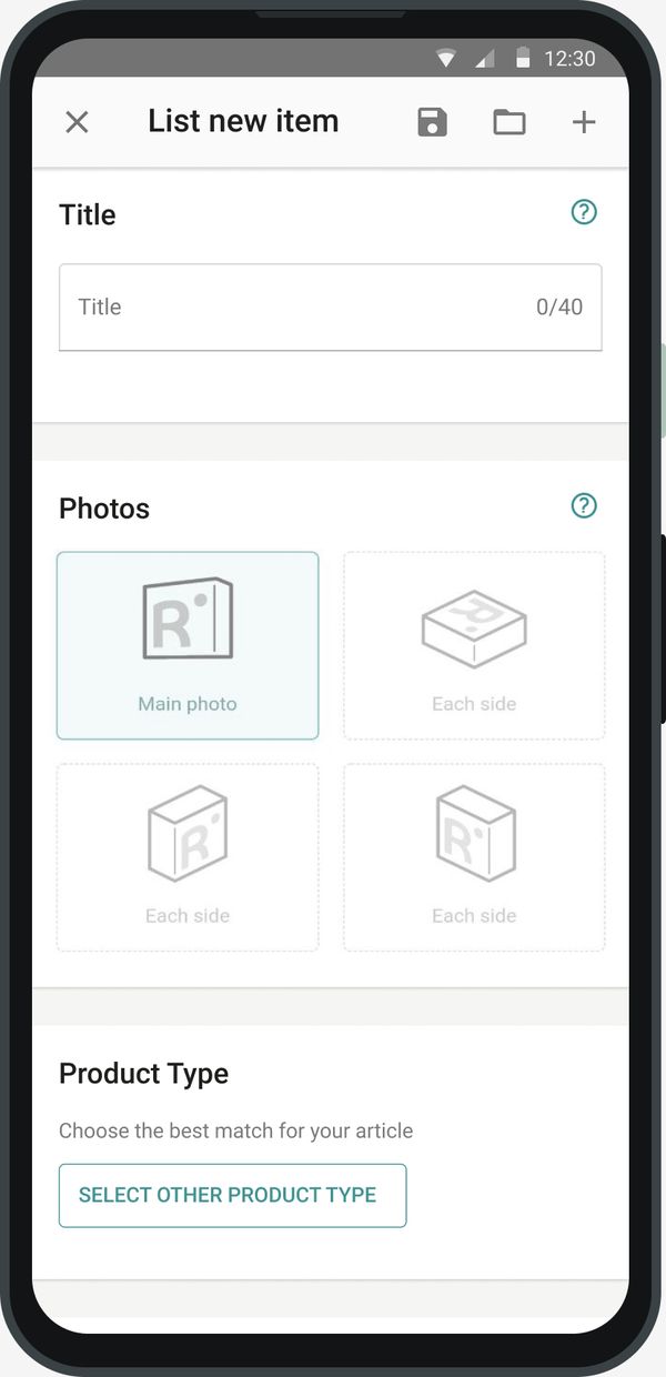
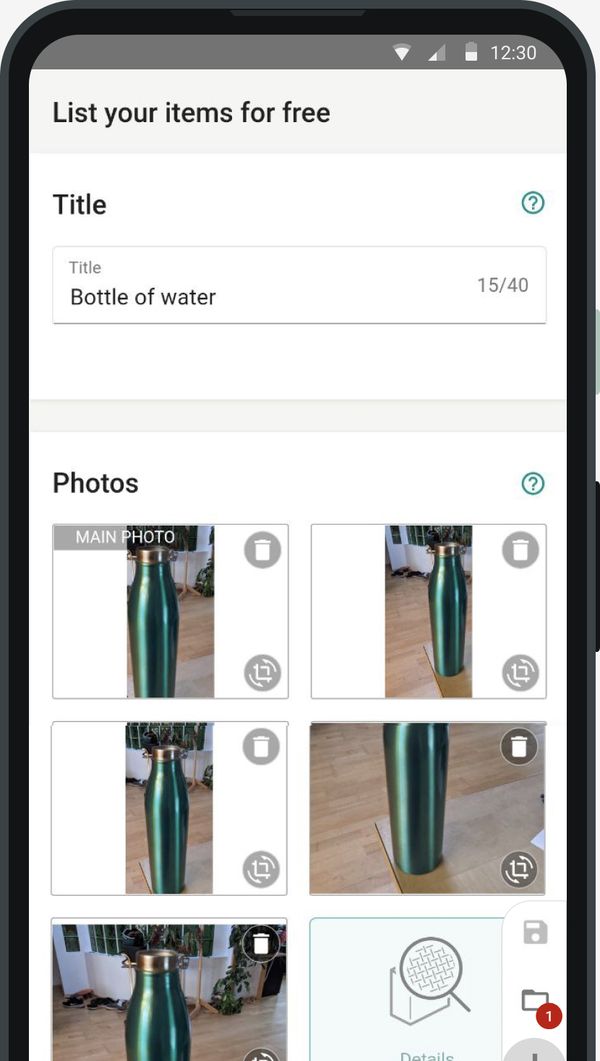
The flow opens as its own window with a fixed header: close on the left, actions on the right.
No bottom tab bar, no right sticky menu.
Standard, touch-friendly components for the header and menus.
Actions down from six to three: save draft, open drafts, new listing.
Why
Fewer things competing for attention means fewer decisions on every screen. Leaving the flow becomes a conscious decision, not an accidental tap on “Search”.
Trade-off: jumping to another page of the site mid-listing takes one more tap. For a task people should finish, that’s the point.
BeforeAfter
↔
Drag the handle to compare. Same form, less around it.
Backed by principle: Hick’s Law and Heuristic #8, aesthetic and minimalist design.
Decision 2 · Improve behaviour
Tell sellers what happened to their draft
What I saw
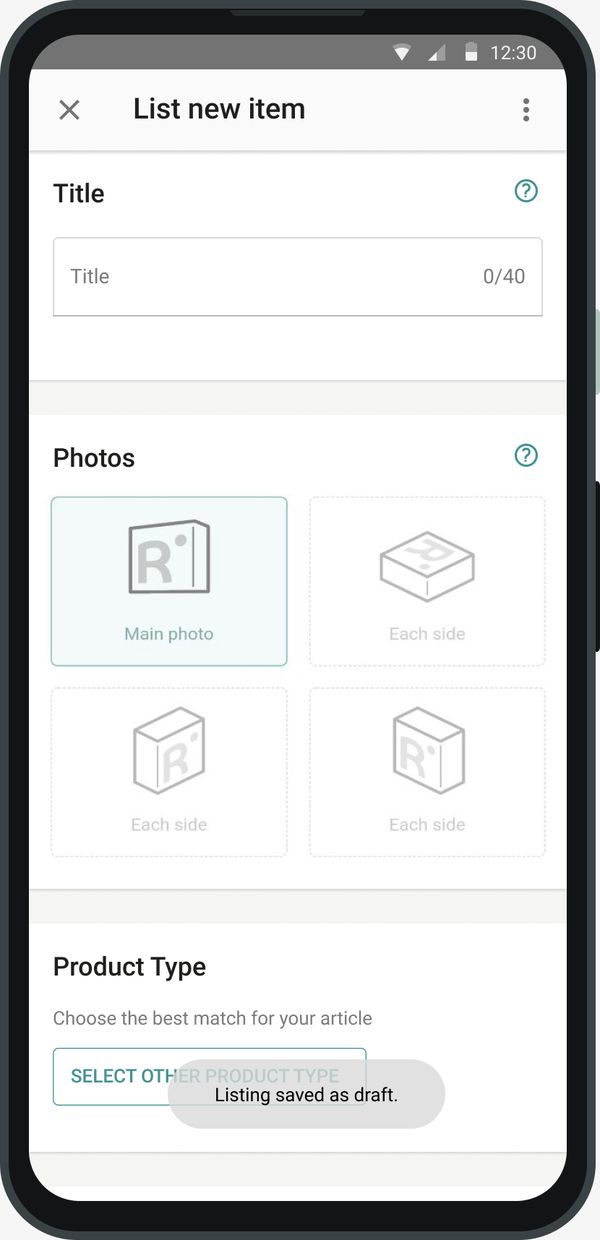
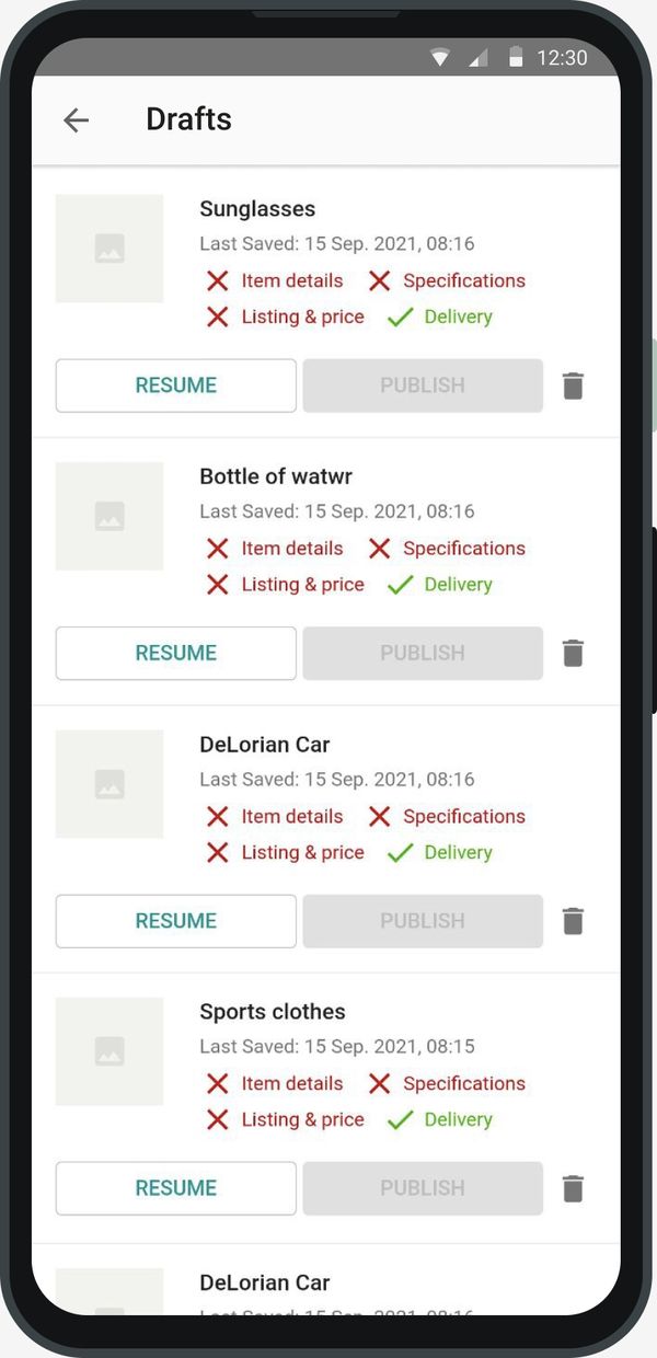
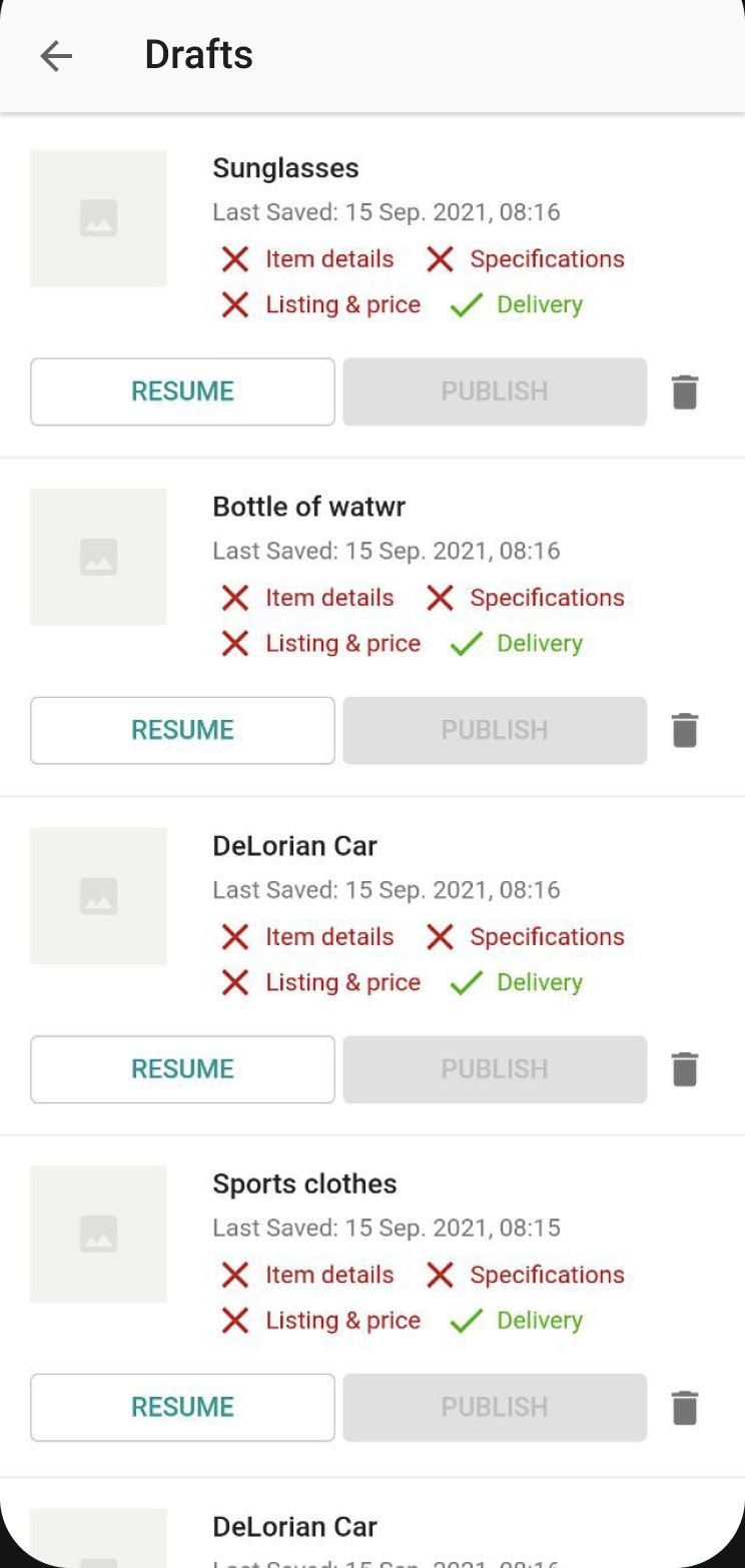
The feedback after “Save draft” wasn’t clear, and didn’t use standard components. “Open draft” showed the drafts in a small overlay on top of the form, with little information about each one.
What I changed
Saving shows a toast: “Listing saved as draft.”
Drafts open in a full page, with the last saved date and the status of each part of the listing.
Each draft can be resumed, deleted, or published once it’s complete.
Why
People trust a long form more when they can see their work is safe. A seller who knows a draft is saved can stop and come back, instead of abandoning.
Save draft
BeforeAfter
↔
Open drafts
BeforeAfter
↔
Backed by principle: Heuristic #1, visibility of system status.
Decision 3 · Improve behaviour
Never lose a listing by accident
What I saw
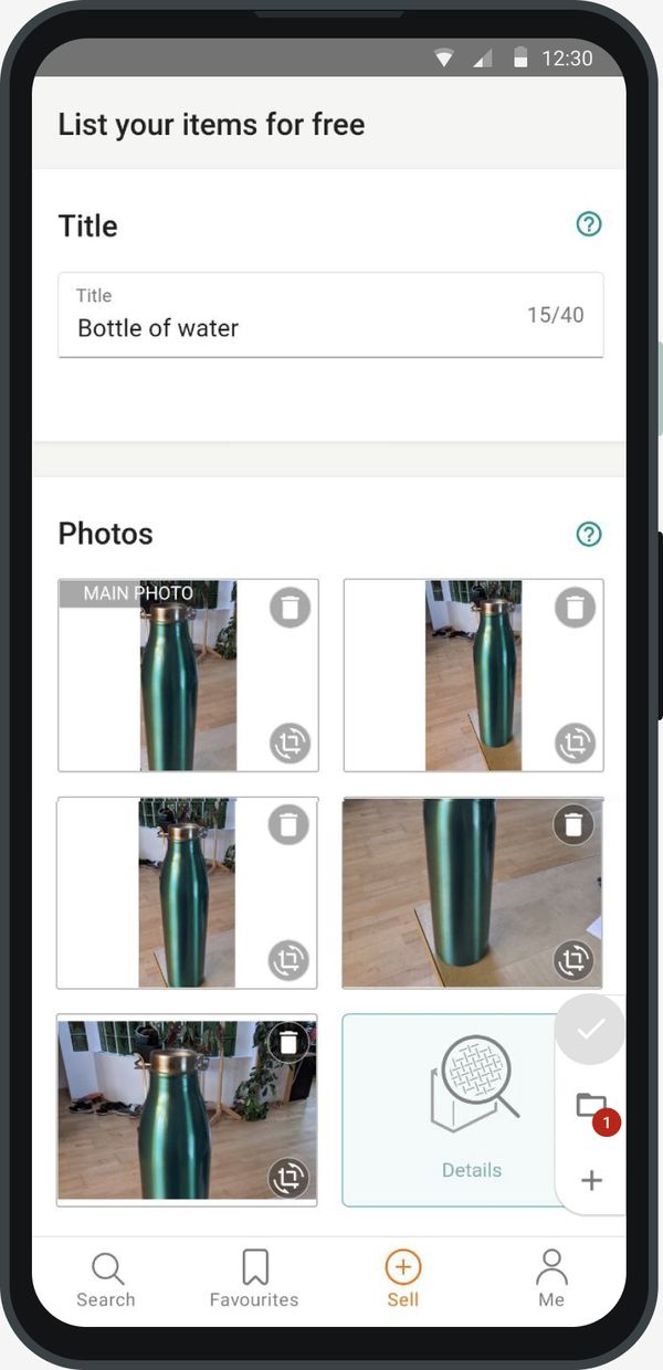
One tap on “start a new listing” reset the whole form, immediately and without a warning. The same could happen when leaving the flow halfway.
What I changed
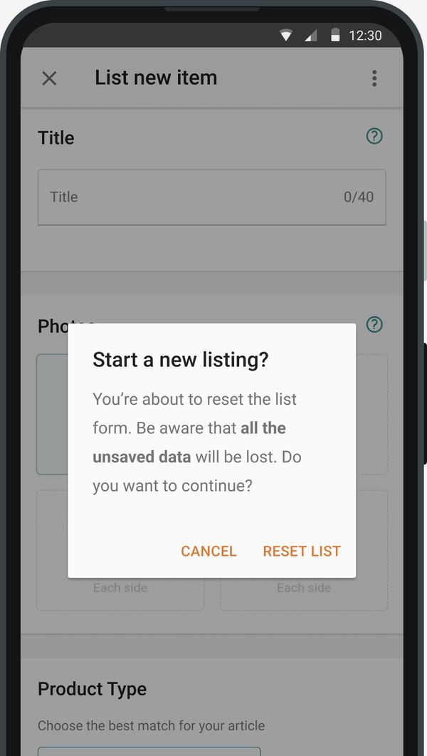
“New listing” asks first: all unsaved data will be lost, cancel or reset.
“New listing” is disabled while the form is empty, so the question only appears when there’s something to lose.
Closing the flow halfway asks for confirmation too.
Why
Losing ten minutes of typing and photos is the fastest way to lose a seller. A confirmation costs one tap; losing a listing costs the listing.
Trade-off: people who really want to start over now tap twice. Disabling the action on an empty form keeps that cost where it’s useful.
BeforeAfter
↔
Before: one tap on + and the bottle is gone. After: the site asks first.
Leaving halfway asks for confirmation.Publishing from drafts stays disabled until a draft is complete.
Backed by principle: Heuristics #5, error prevention, and #9, help users recover from errors.
Decision 4 · Divide the flow
Three short steps instead of one long page
What I saw
Nine sections on one page, and errors listed only at the end. Sellers couldn’t tell how far they were from publishing.
What I changed
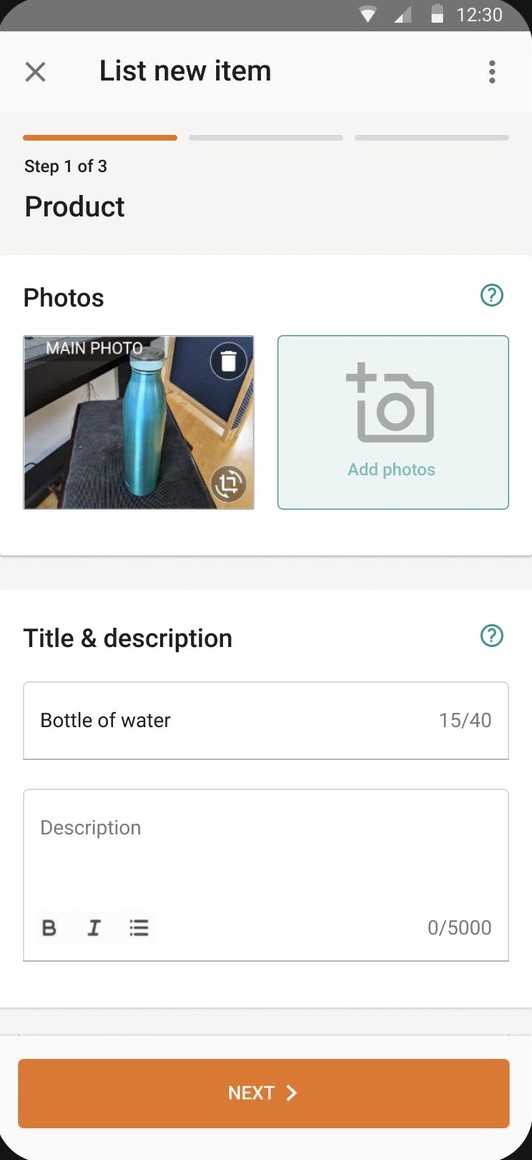
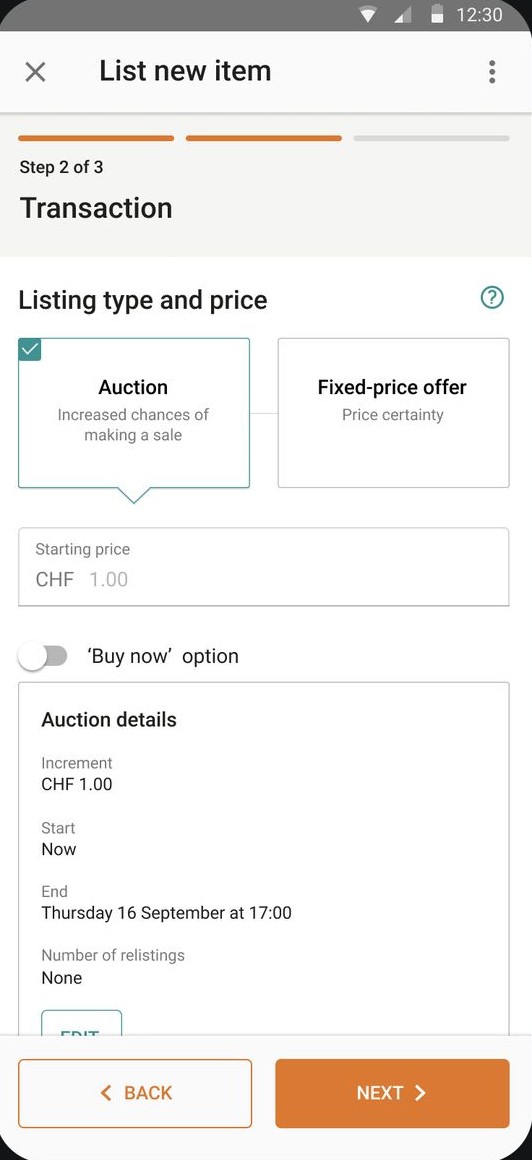
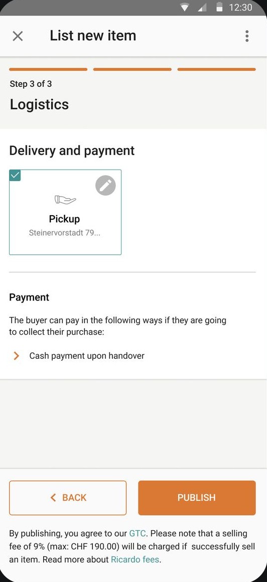
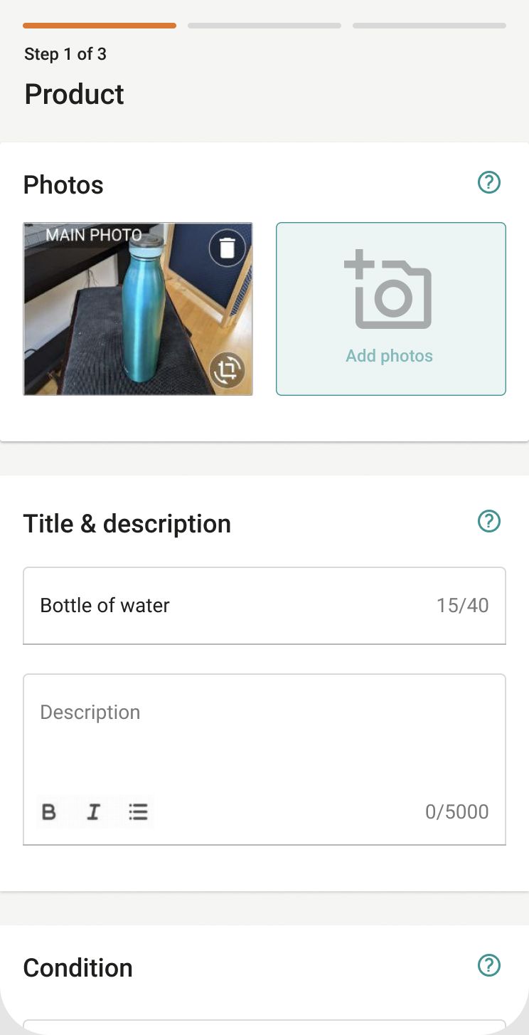
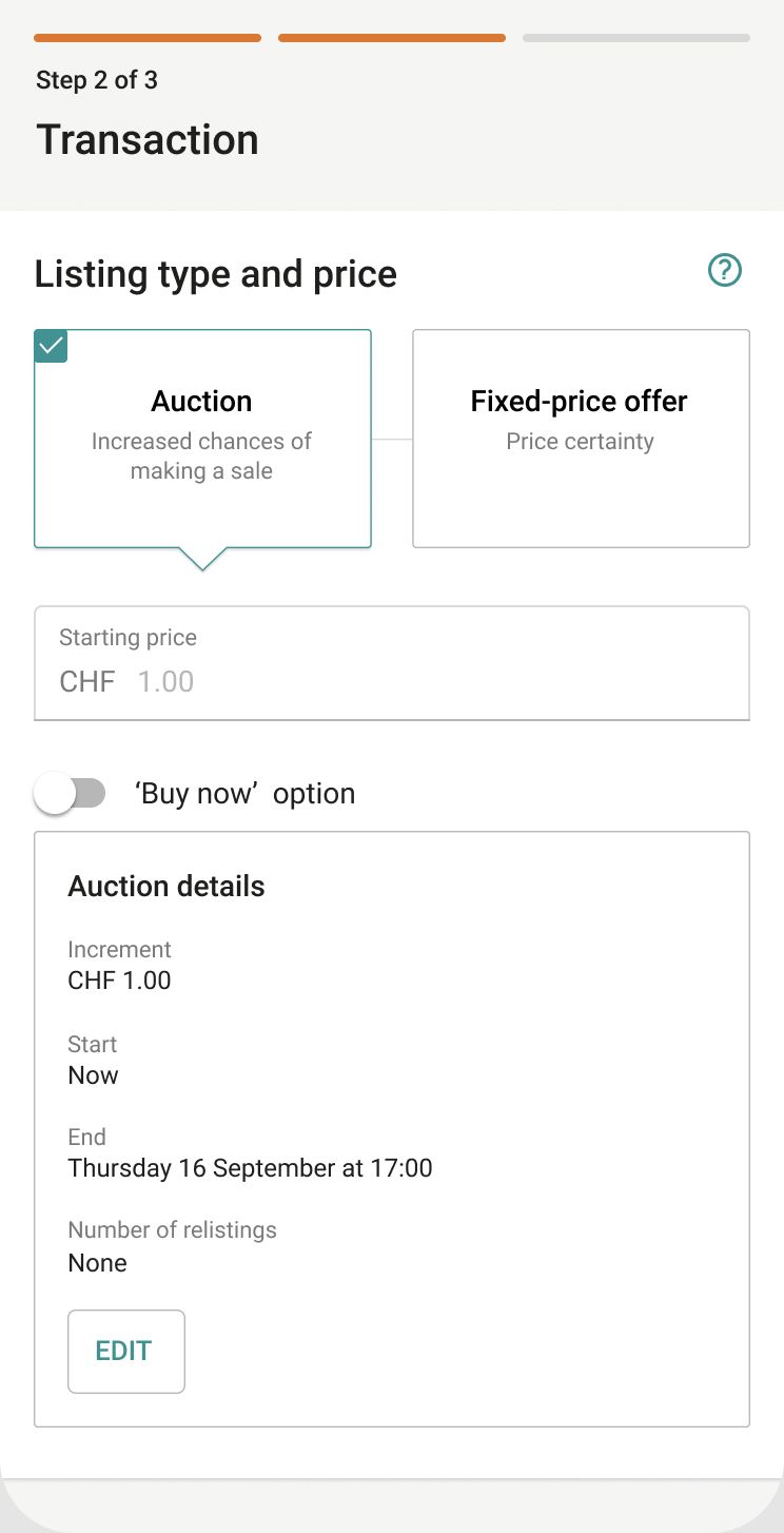
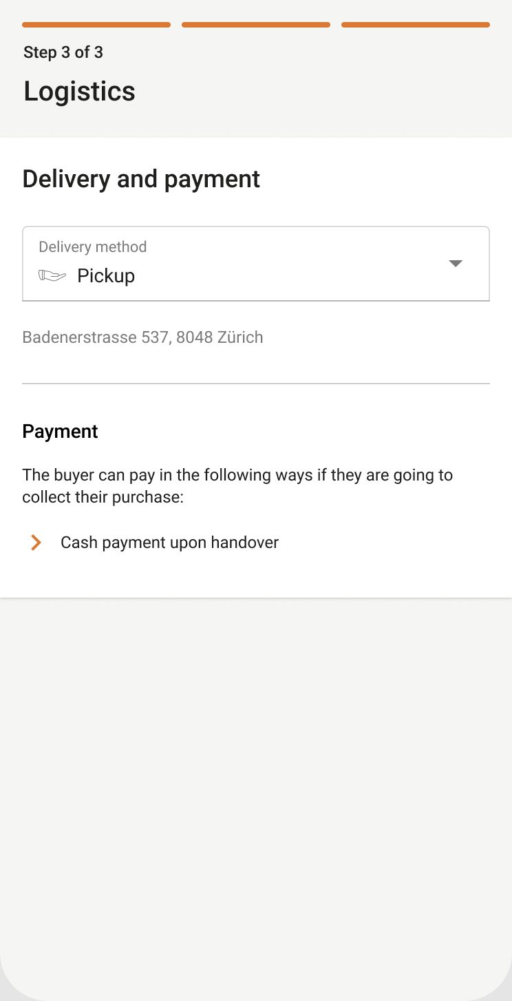
Three steps with a progress bar: Product, Transaction, Logistics.
Each step checks its own fields, with a short summary of what’s missing next to the button and the error on the field itself.
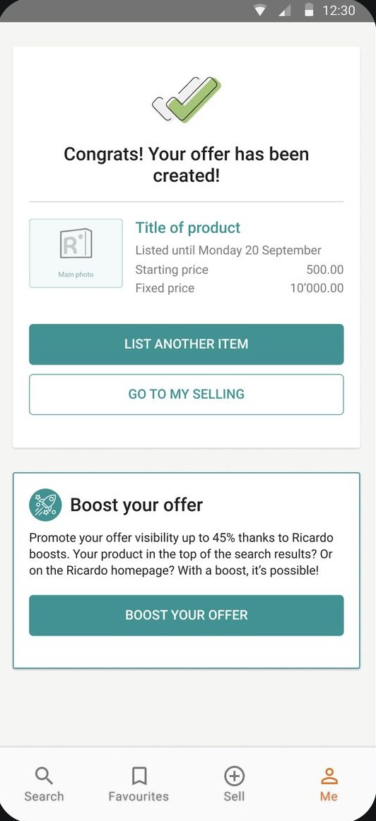
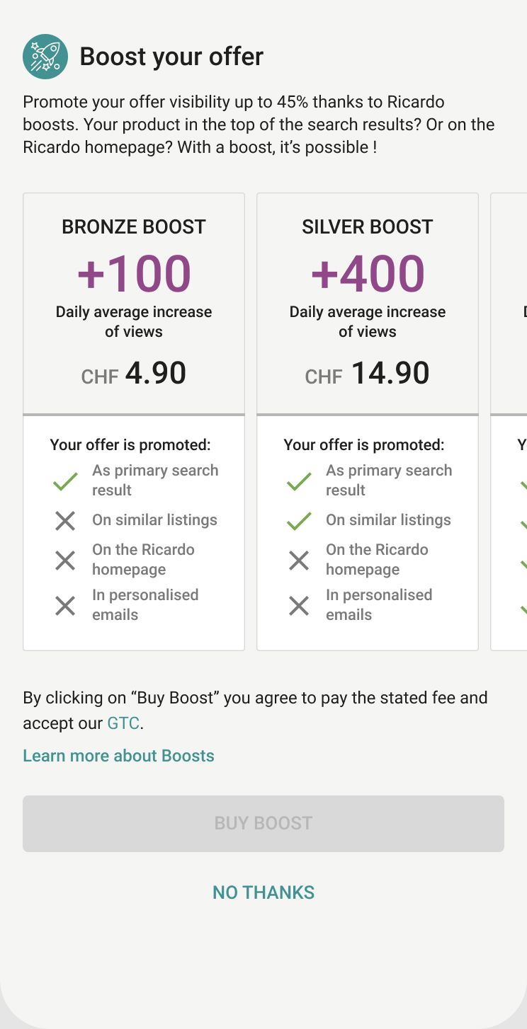
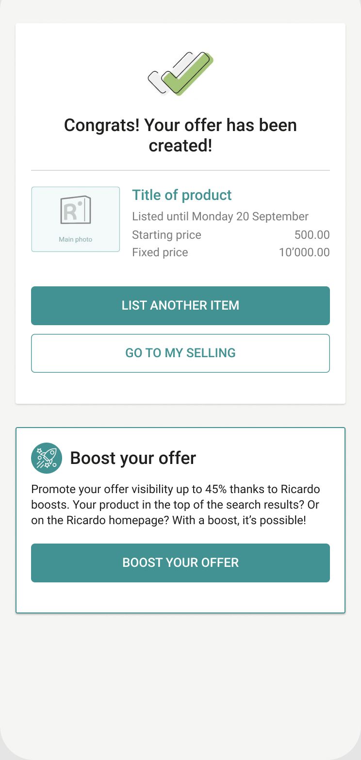
The boost offer moved out of the form, to a separate “One last thing!” screen after Publish that you can skip.
Why
Smaller chunks mean fewer choices at once, and a visible finish line pulls people forward. Moving the paid boost out of the form means an optional upsell no longer sits between the required fields.
Trade-off: more screens and taps. Each step is a new place where people could drop off, which is why I’d A/B test this one against the current page.
“To advance, please provide the following details”: the summary stays short because it only covers the current step.
Backed by principle: Hick’s Law, progressive disclosure, and the goal-gradient effect.
Decision 5 · UI consistency
Similar inputs should look and work the same
What I saw
Photos, condition, product details, delivery and bank account each used their own pattern. Some hid options in chips, others in long forms.
What I changed
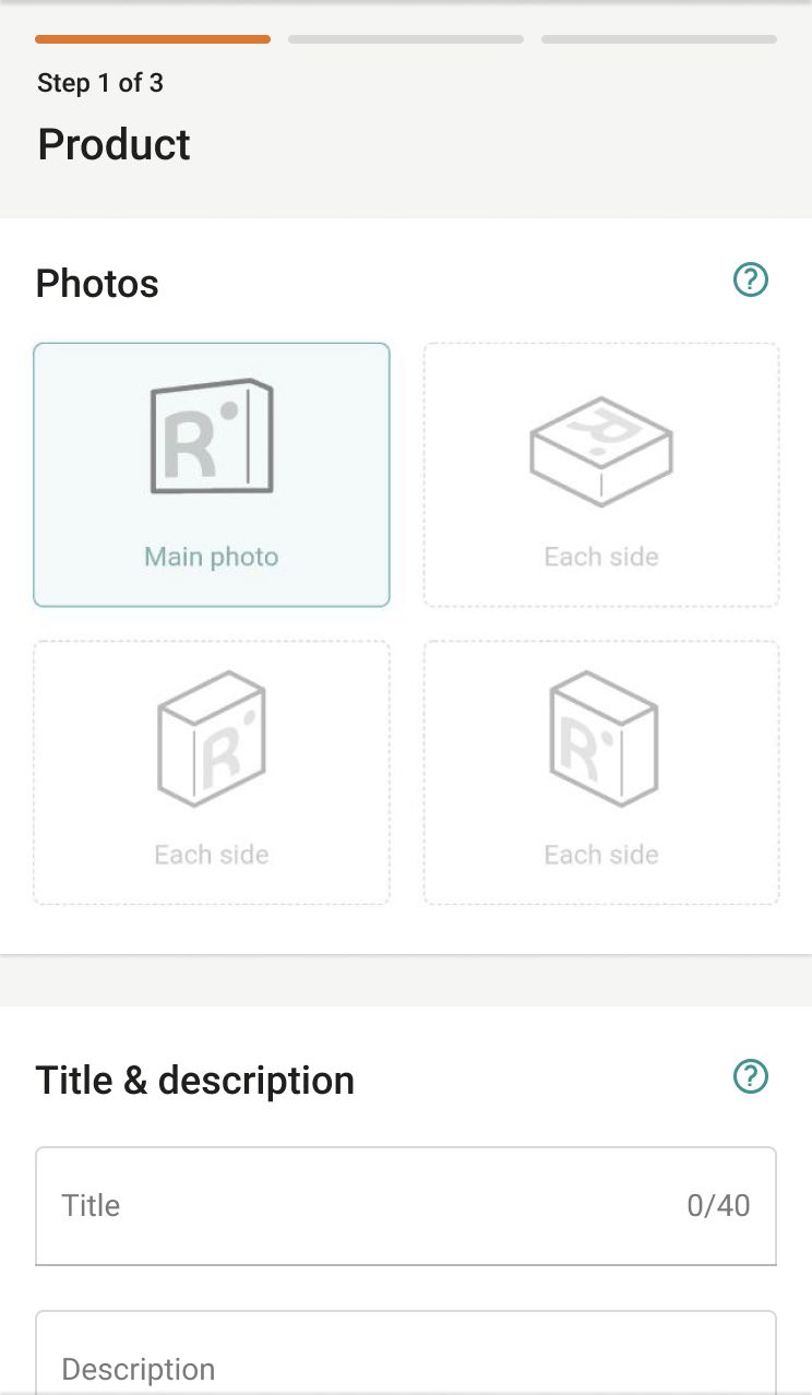
One photos component: main photo, then “add photos”.
Condition as a standard select with a description for each status.
Product details, delivery and bank account built from the same fields and dropdowns.
Why
When every section speaks the same visual language, sellers recognise what to do instead of figuring it out again. It’s also cheaper to build and maintain.
Photos and condition: current component and proposal.Product details and delivery & payment: current component and proposal.
Backed by principle: Heuristics #4, consistency and standards, and #6, recognition rather than recall.
06The prototype
To make the proposals concrete, I built an interactive prototype of the new flow. Here’s a version you can click through.
It uses my screens from Figma. Try the tasks on the right: they cover the moments where the old flow lost people.
12:30
List new item
To advance, please provide the following details: Photos ; Title ; Description ; Product Type ; Category
List new item
List new item
By publishing, you agree to our GTC. Please note that a selling fee of 9% (max: CHF 190.00) will be charged if you successfully sell an item.
One last thing!
SearchFavouritesSellMe
You left the listing flow
On the real site you’d be back where you came from. Your draft is only kept if you saved it.
Start a new listing?
You’re about to reset the list form. Be aware that all the unsaved data will be lost. Do you want to continue?
Leave the listing flow?
Your listing isn’t published yet. Unsaved data will be lost if you leave now.
Interactive prototype
List a bottle of water
The form starts filled in, like a seller halfway through. Use the ⋮ menu and the buttons inside the phone.
Now on: Step 1 of 3 · Product
1Save a draftOpen ⋮ and save. You get a confirmation instead of silence.
2Try to start over⋮ › New listing asks before wiping anything. Once the form is empty, it’s disabled.
3Close the flow halfwayThe ✕ asks if you really want to leave.
4PublishGo through the three steps, then decide on the boost.
A redesign only helps if it ships and works, so I ended the proposal with how I’d take it from slides to production.
Design review
Go through the proposals with the team, and challenge them against business requirements.
Technical feasibility
Check with engineers what each change costs, and what the legacy code allows.
User testing
Test interactive prototypes with beginners and experienced sellers.
Build in parts
Ship the four improvements one at a time, in the order the data supports.
A/B test
Compare the old and new flow on real listings before rolling out.
Clickmaps & analytics
Watch where people tap, hesitate and leave, and feed that into the next iteration.
How I’d measure it
These are the metrics I’d set up for the A/B test. They’re a plan, not results: nothing here was built or measured.
Conversion rate
Listings published ÷ listings started. The goal from the brief.
Drop-off per step
Where people leave: Product, Transaction, Logistics or boost.
Time to publish
From opening the flow to a published listing, without lowering listing quality.
Lost work
Resets and exits on a filled form, and how many saved drafts get resumed.
What I’d explore with more time
Where people actually give up. With abandonment data per section, I’d reorder the four improvements by impact instead of by effort.
Beginners and experienced sellers. Power sellers list many items. The second goal of the brief, more items per user, probably needs shortcuts like “list a similar item”.
The sticky menu’s history. Understanding why it was added would tell me whether removing it breaks a habit someone relies on.
Browsers. I designed a mobile web layout with Material-style components. I haven’t tested it across iOS and Android browsers; that’s the next step.
08Outcome and reflection
As a design challenge, this wasn’t built. In one week I delivered the flow analysis, the questions, the critique, four incremental proposals, an interactive prototype and a plan to validate them.
What I learned
Conversion problems in long forms are rarely about one screen. They come from many small moments: a choice too many, a button that does something unexpected, an error that shows up too late. Naming each moment, and the principle behind it, made the proposals easy to discuss.
What I’d do differently
Looking back, I’d get even one data point before proposing, like where sellers abandon, and test the three-step split early. Splitting a form can help or hurt conversion, and only real sellers can tell which.
Related Work.
Other projects where I redesigned a flow end to end.
Whether you’re ready to start a project or just want to chat about your ideas, feel free to reach out! I’m always open to discussing new opportunities.