
Product Design

App | Flying Money

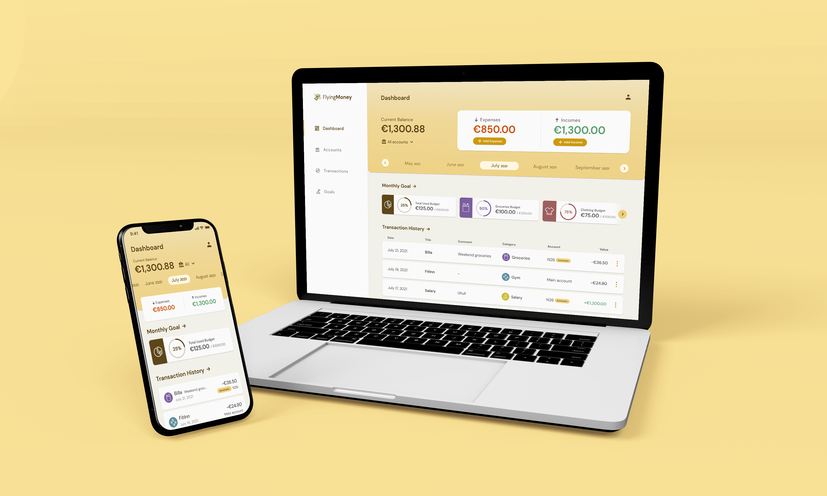
A concept budget planner that shows where your money goes each month and helps you stick to the budget you set.

Background Line
My role

Solo designer: research, UX and UI

Timeline

2021, 20 hours

Type

Personal concept project

Platforms

Mobile app and web platform

Method

The Elements of User Experience (Jesse James Garrett)

The problem

Planning money should be easy

People want to organise, plan and see their finances easily, so they can reach their financial goals.

What I did

From questions to a finished interface

I asked 5 people who use budget planners about their needs, reviewed 6 existing apps, defined the scope and structure, sketched on paper, wireframed the flows and designed the final UI.

The outcome

A complete concept for mobile and web

Dashboard, transactions, accounts and budgets, with a full budget-creation flow, a prototype and a style guide.

01The goal

Design a cross-platform product that lets people manage their finances: create and adjust budgets to reach savings goals, and see their spending across all their accounts in one place.

User story

As a user, I want to organise, plan and visualise my finances easily, so I can achieve my financial goals.

What it must do
  • Create and adjust budgets
  • Plan expenses and customise saving targets
  • Integrate with banks and financial tools
  • Show a spending overview and reports
  • Work on mobile, tablet and desktop
02Understanding the need

Before drawing anything, I wanted to know why people use a budget planner and what makes them stay or leave.

Questionnaire, 5 people

I sent it to people from my social circle who use different budget planning platforms:

  1. What made you look for a budget planner?
  2. Why do you use this specific planner?
  3. What do you like the most? What would you improve or fix?
  4. Have you tried another one? If yes, why did you change?
Competitor review, 6 apps

I explored Mobilis, Money Manager, CoinKeeper, YNAB, Organizze and Mint to understand what exists in the market today.

The six budget planners I reviewed.
03My approach

I used The Elements of User Experience, which takes a product from the most abstract layer to the most concrete one. It kept me from jumping into screens too early.

Strategy

Product objectives and user needs: questionnaire, user story, competitor review.

Scope

The list of things the product must do.

Structure

Five areas: onboarding, dashboard, transactions, accounts, budgets.

Skeleton

Paper sketches, then wireframes and flows.

Surface

Style guide and final layouts.

The structure: what each of the five areas has to contain.
04Key decisions

Four decisions define how the product works. For each one: the need, what I designed, and why.

Decision 1

Answer "how am I doing this month?" first

The need

The scope asked for an instant overview of spending across accounts.

What I designed
  • The current balance sits at the top of the dashboard, with an account switcher next to it.
  • A month selector, then expenses and incomes side by side.
  • Budget progress and the latest transactions follow below.
Why

The dashboard reads top to bottom from the big picture to the detail: how much I have, what came in and went out, how my budget is doing, and what I spent on.
Sketch
The first paper sketch, with notes on each block.
Final
The final dashboard keeps the same order.
Decision 2

Create a budget in four small steps

The need

Users should be able to easily create and adjust budgets to reach their savings goals.

What I designed
  • Set how much you can spend this month.
  • Pick the categories you want goals for.
  • Distribute the amount until the remaining budget reaches zero.
  • See a confirmation, then track progress per category.
Why

One question per screen keeps a task that feels heavy light. Distributing down to zero means the category budgets always add up to the total the user set.

The budget creation flow, in wireframes.
The budget screen right after creation, and after a few expenses.
Decision 3

Add an expense on a single screen

The need

Adding expenses is the action people repeat most in a budget planner.

What I designed
  • The amount comes first, with the keypad already open.
  • The account and date are pre-selected, with "Today" and "Yesterday" as quick options.
  • Category is a chip; the comment is optional.
Why

The most frequent task should take the fewest taps. Sensible defaults mean most expenses need only an amount, a title and a category.

The "Add expense" screen, annotated.
Decision 4

Treat synced and manual accounts differently

The need

The product has to integrate with banks, but people also keep cash or accounts they track by hand.

What I designed
  • Accounts can be linked to a bank or added manually with an initial balance.
  • Synced accounts carry a label.
  • The balance can't be edited on synced accounts.
Why

If the bank is the source of truth, letting people edit that balance would make the numbers unreliable. Manual accounts stay fully editable.

The accounts sketch, with the note: "Balance can't be edited on synced accounts".
05The final design

A warm, calm look for a topic that often feels stressful, with one typeface, a yellow and brown palette, and a colour per spending category.

Style guide: DM Sans, the yellow palette, category colours and icons.
Mobile app, with the budget and transaction cards.
Web platform dashboard.
Where the web dashboard started.
Sketch of the transactions page.
06Reflection

This was a personal project, so it was never built or measured. What it shows is how I take a product from an open brief to a finished interface.

Let’s make it happen.

Whether you’re ready to start a project or just want to chat about your ideas, feel free to reach out! I’m always open to discussing new opportunities.